
















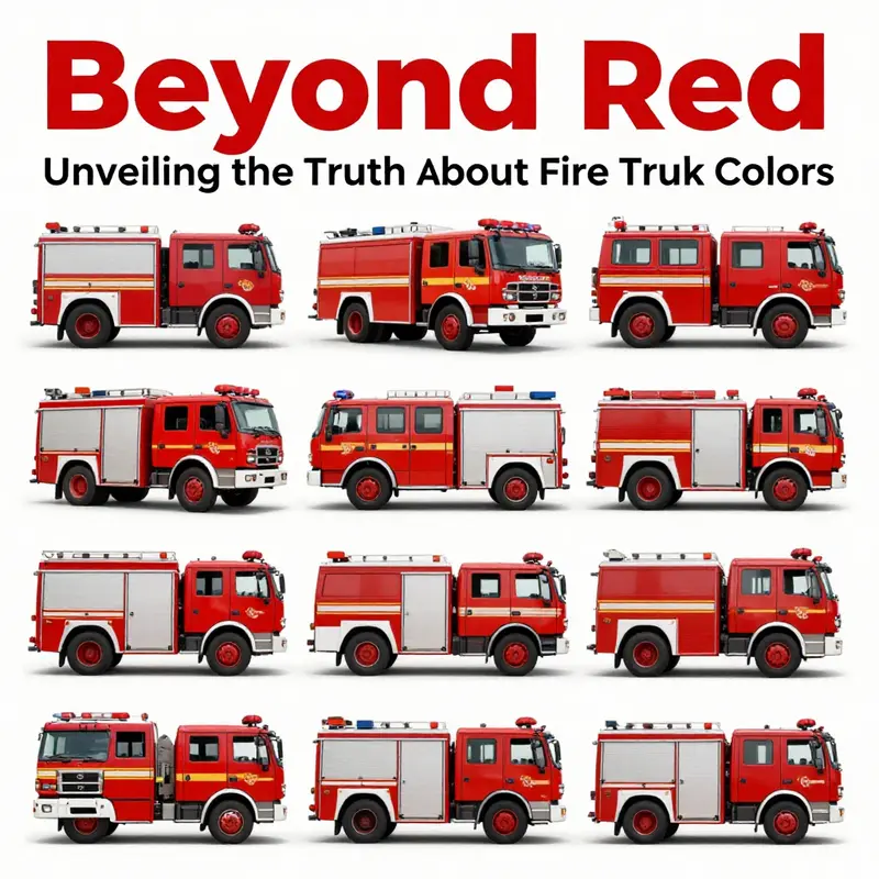
The vibrant presence of fire trucks on our streets is often symbolized by their iconic red color. However, as the world progresses, it’s essential to recognize that fire trucks come in a variety of colors, influenced by historical contexts, visibility research, psychological factors, safety regulations, and cultural diversities. This exploration delves into the reasons behind the traditional red and examines how operational safety and effectiveness have prompted fire departments worldwide to rethink their color choices. Throughout this article, we will see how history influenced the ubiquitous red, how modern visibility standards advocate for other colors, the psychological implications behind color perception, and the regulations that enhance safety through design. We’ll also journey around the globe to understand diverse cultural interpretations of fire truck colors.
Scarlet Origins and the Color of Call: Tracing the Red Thread Through Fire Truck History
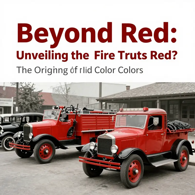
Scarlet is the color most people instinctively associate with a fire truck, a hue that seems to carry urgency in its very wavelength. Yet the history behind that color is not a single decree but a braided narrative woven from practicality, culture, and the slow, incremental adoption of safety science. To understand why not all fire apparatus are red today, we must travel back to the dawn of motorized firefighting, when communities sought a signal that could reach beyond the roar of the street and into the collected memory of a neighborhood. The early 20th century was a moment when public services began to define themselves through visibility, reliability, and the stubborn optimism that technology would keep pace with danger. In that milieu, red rose as a seemingly obvious choice, yet with as many questions as certainties about its effectiveness on a bustling, evolving urban landscape. The tale is not a simple banner that declares red everlasting; it is a ledger of decisions that echo through today’s streets every time a vehicle lights up and slides into a firehouse bay. A popular anecdote about the color’s origin centers on Henry Ford’s Model T era, when black cars seemed to dominate the road and red equipment stood out against the dull gray of urban surfaces. The story suggests fire departments chose red precisely to contrast with the sea of black automobiles, ensuring the emergency apparatus could be spotted quickly. Historians, however, remind us that this particular line of reasoning blends folklore with conjecture. The truth is messier, and perhaps more telling: visibility did not hinge on a single, dramatic choice but on a confluence of factors that made red a durable, economically sensible option long enough to become tradition. Paint chemistry and cost mattered. Early red lacquers, including red lead-based pigments, were among the most affordable and resilient coatings available for metal. They resisted weathering and rust, which was a practical advantage for vehicles that faced exposure to rain, road salt, and the friction of daily use. In the eyes of many departments, durability and economy were not mere considerations but determinants of who could roll out the door in time to save lives. Beyond the economics, color also carried social and cultural weight. In many communities, especially those with volunteer brigades, painting engines and apparatus red became a statement of readiness, pride, and a willingness to stand out. Red was bold, loud, and difficult to ignore—an asset in a town where a siren was a daily reminder of collective responsibility. The color helped distinguish service from private ownership or rival groups, and over time, the practice hardened into tradition. Red, in this sense, was less a calculation of visibility per se and more a social signal—a shorthand that the community had mobilized, trained, and prepared to respond. The psychological pull of red also factored into the equation. The color has long been associated with danger, warning, and action. When people hear a siren and see something red approaching, the brain responds with a reflex tied to alertness and urgency. This is not a theory squeezed from folklore alone; it aligns with broader findings in color psychology about how certain hues prime people to react quickly. Yet even this dimension does not settle the question once and for all. As urban landscapes changed, so did the understanding of how people perceive color on the move. The road became busier, the cognitive load higher, and the demands on emergency vehicles broadened to include predictability in traffic, legibility from multiple angles, and rapid recognition in a mosaic of street furniture, signage, and other vehicles. As the decades turned, the Korean War era and postwar modernization, among other shifts, intensified a new conversation: color is an element of a larger safety system. Fire departments began to incorporate brighter materials, reflective striping, and high-intensity lighting to amplify visibility beyond what paint alone could achieve. The raw color of a vehicle could be powerful, but it became only one thread in a tapestry that includes retroreflective materials, conspicuous lighting, and standardized markings. This is where the modern shift away from a uniform red becomes understandable rather than controversial. If the job is to be seen clearly in daylight, dusk, fog, or rain, an entire signaling system is called into play. Color remains a component, but it is now part of a broader design strategy that prioritizes immediate recognition and safety in motion. In practice, many departments have experimented with yellow, lime-yellow, and other bright hues that can offer higher daytime visibility against urban backdrops. The evidence from visibility research points to as much as a 30 percent difference in being spotted under certain conditions when comparing red to lime-yellow or fluorescent greens. The logic is not anti-red but pro-safety: use the color that reduces reaction time for bystanders, drivers, and pedestrians while still maintaining the vehicle’s identity and the department’s branding. Cities around the world have reflected these findings in policy and procurement choices. In North America and Europe, for example, some departments have adopted yellow or lime-green schemes for their primary fighting fleets, particularly where high-speed response or dense traffic makes visibility a critical concern. However, color is not the sole determinant of safety. Modern fire trucks depend on a synergy of design features. Bright, legible lettering, high-contrast markings, and reflective tape work in concert with color to catch the eye. Lighting systems—strobes, beacons, and LED arrays—provide another layer of conspicuity, functioning across a wider spectrum of light levels than color alone can address. The psychological impact of red persists, and many departments retain red as part of their visual language, especially where tradition and local identity play a meaningful role in public trust. Yet this coexistence of red with other high-visibility strategies demonstrates a broader truth: fire trucks are now designed as multisensory cues rather than single-signal objects. Identity and branding also shape color decisions. Some departments use distinctive palettes to reflect their locale or to carve out a visual niche within a region with many neighboring services. In such contexts, color becomes a form of signaling that the department’s crews are prepared, professional, and part of a longer lineage of public service. The choice to diverge from red is not a repudiation of history but an adaptation—an evolution that acknowledges that tradition can endure even as safety science advances. In other words, red remains a powerful cultural symbol of firefighting, but it is not the sole determinant of how modern equipment is colored or perceived on today’s streets. As this chapter threads together the past with the present, it is worth noting the practical realities for people who maintain and operate fleets of fire apparatus. Even as color choices shift, the work of keeping a fleet safe involves a broader ecosystem of maintenance, equipment, and infrastructure. The color of the vehicle is just one line of defense among many. Factors such as weather sealing, corrosion resistance, and the durability of coatings still matter. For those involved in keeping the hardware in top form, components and parts play a crucial role in longevity and reliability. And while color can evoke a public response, it is the sum of engineering, training, and procedure that ultimately determines how quickly a fire unit can respond, what caregivers and bystanders observe, and how effectively firefighters can navigate the streets under pressure. For readers curious about the everyday material side of this world, there is a practical entry point in the broad category of fire-truck parts, which supports ongoing maintenance and upgrades across diverse fleets. The historical arc—from a pragmatic, cost-conscious choice rooted in early industrial colorants to a contemporary, safety-driven palette rooted in visibility science—offers a clear lesson. Color itself is historically contingent; it is shaped by technology, economics, and the social meanings attached to public service. Yet color continues to matter, not as a solitary determinant but as a signal that gains its strength from supplemental cues: reflective materials, lighting, typography, and the disciplined practices of training and response. The red of old stories remains a potent symbol, a legacy that many communities carry with pride. At the same time, today’s fleets acknowledge that perception is a moving target—one that shifts with the light of day, the conditions of the road, and the evolving expectations of a public that depends on rapid, reliable emergency service. The conversation about color, then, is less about choosing a single winner and more about orchestrating a cohesive system of visibility, safety, and identity that adapts to changing times while honoring the enduring mission of firefighting. For readers who want a concise historical framing beyond the narrative here, a recent external discussion encapsulates the key tensions: red as a symbol of urgency and tradition, counterbalanced by modern evidence in favor of brighter, high-visibility hues under certain conditions. This balance between heritage and science reflects a broader pattern in public safety design, where time-tested symbols coexist with innovations intended to reduce risk and improve outcomes for communities and responders alike. External resources offer additional angles on this topic, and they remind us that the question is as much about how people respond to color as it is about what color a vehicle wears. See the external reference for a compact synthesis of origins and evolving practice: https://www.firedepartmentnews.com/why-are-fire-trucks-red-history-and-reasons-explained/.
Beyond Red: The Shift Toward Brighter Fire Truck Colors and What It Means for Safety
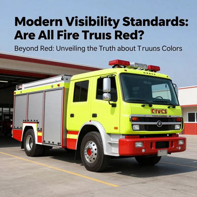
When people ask whether all fire trucks are red, the answer opens a larger conversation about visibility, safety, and how fire services evolve. Red remains a powerful symbol with historical roots, but visibility science shows that brighter colors like lime-yellow or lime-green can be easier to notice in daylight, fog, or heavy traffic. Modern fleets often mix a bright body color with retroreflective striping and high-intensity lighting so that a vehicle reads quickly as an emergency unit. The choice is rarely one color alone; it is a system: color, lighting, and markings that together reduce detection time and improve safety. Jurisdictions weigh tradition against potential gains in conspicuity, pilot new schemes, and plan repainting as fleets cycle out of service. The upshot is a measured shift toward brighter palettes while keeping the core identity of the fire service intact.
Beyond Red: Color Perception, Psychology, and the Evolving Answer to ‘Are All Fire Trucks Red?’
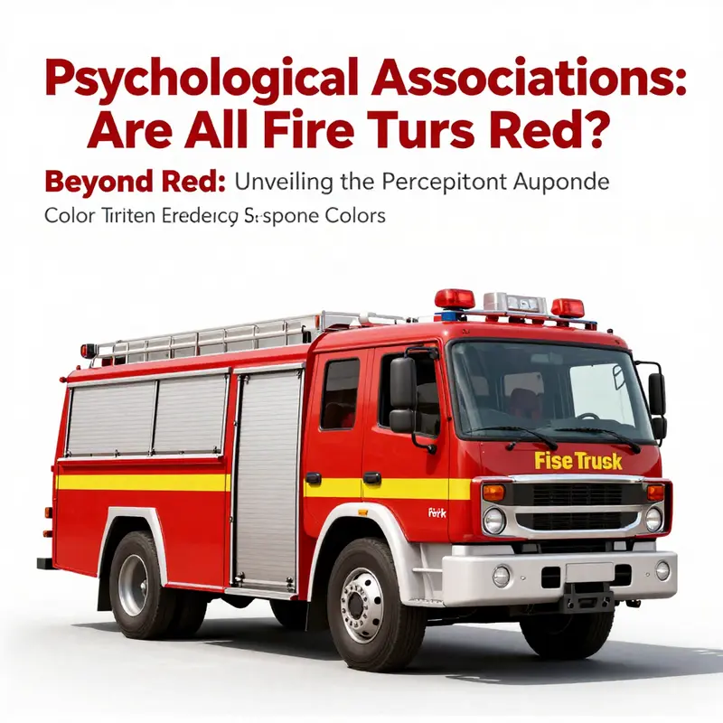
Ask most people why fire engines are red, and you will likely hear a story about the early days of motorizing fire apparatus and the dominance of black Model T Fords. That tale has a certain romance, but it is largely folklore. The real arc traces a blend of practical choices and cultural signaling that hardened into a symbol. In the 1920s, red paint was one of the most affordable and durable options for metal surfaces. Red iron oxide pigments resisted fading and weathering, and departments could stretch limited budgets further while preserving a vivid appearance. The color thus traveled from cost efficiency into a standard, a shared badge that signaled readiness and public visibility. But alongside the practical economics, a deeper, more enduring force was at work: the psychology of color. Red has long been linked to urgency, danger, and action. In quick glances, the color triggers heightened arousal, a reflex that aligns with the needs of emergency response. While we might smile at the idea of a singular color shaping an entire profession, the reality is that perception itself helps define behavior. Red becomes not just a hue but a cue. It whispers to drivers and pedestrians that something critical is at hand, that time matters, and that dispersing danger requires rapid attention. Over generations, this association reinforced a public image of firefighting itself—dramatic, instantaneous, unmistakable. The fire truck so visualized is not merely a means of transport but a moving symbol in a community’s psyche. The color carries memory as much as function, a social shorthand that helps families recognize the dangers that might be nearest them at a moment of crisis. Yet the story of color does not stop with symbolism. It travels into the realm of perception and visibility, where science asks a different question: which colors actually stand out under real-world conditions when speed and safety are on the line? Here the tale becomes more nuanced. Modern visibility research points toward colors such as lime-yellow, fluorescent green, and orange as often more conspicuous in daylight and in adverse weather conditions. These tones tend to offer higher contrast against urban backdrops and foliage, and in fog or rain they can pop more readily than red. The evidence is not merely anecdotal; it rests on measurements of conspicuity—how readily a vehicle catches a driver’s eye as it moves toward and past observers. The upshot is that some departments have embraced these brighter options to maximize safety. The practical implication goes beyond the color itself. Fire apparatus today are not only painted in vibrant hues; they rely on a suite of safety features that complement color. Retroreflective striping, high-intensity lighting, and loud, reliable sirens work in concert with color to create a highly visible profile. The net effect is a layered approach to conspicuity where color serves as an important, but not exclusive, component of safety. This shift does not erase tradition; it negotiates it. In cities across North America and parts of Europe, yellow or lime-green trucks appear alongside red ones, each choice rooted in local decision-making, incident history, traffic patterns, and branding strategies. The color becomes a signal not only of function but of local identity. Some departments seek to distinguish themselves within regional networks, turning color into a badge that communicates more than just alertness. When color becomes part of identity, it can reinforce cohesion within a department and help the public differentiate between nearby services. It can also complicate interoperability, particularly when neighboring jurisdictions share roads and mutual aid needs. Yet even as color choices diversify, the role of color in emergency response remains part of a broader safety framework. In the modern design of fire apparatus, color is considered alongside reflective materials, lighting, and warning systems as parts of a single, integrated system. The goal is to ensure that a vehicle is quickly perceived and understood in the diverse contexts where it operates—from a bright summer street to a foggy morning highway, from a quiet neighborhood street to a crowded downtown corridor. This integrated perspective matters for the eye and for the mind. A color on its own may not suffice; the audience must interpret it correctly and quickly. For drivers, cyclists, pedestrians, and even fellow responders, a clearly recognized vehicle shape and color pattern can reduce reaction time, which can translate into saved minutes, or even saved lives, at the scene. Science also recognizes that perception is filtered through experience. People accustomed to a red fire truck may instinctively interpret its approach as urgent, while those in communities with lime-yellow fleets may respond more rapidly to the same presence because the color aligns with local norms. The important point is not that one color is universally best, but that communities continually adjust color choices to maximize safety given the conditions they face and the messages they wish to convey. In practice, departments balance several variables: visibility under varied lighting, maintenance costs, weathering of pigments, and the emotional resonance of the color with residents and responders. A color change is rarely undertaken as a single, isolated decision. It triggers procurement cycles, repaint schedules, and retraining for drivers who must recognize the fleet in a split second. The decision also touches branding: a department may select a color to symbolize resilience, heritage, or a forward-looking approach to safety. The visual language of fire rescue extends beyond the color itself. The chassis, the silhouette, the placement of panels and windows, the arrangement of lights, and even the font on the side panels all contribute to legibility and recognition at speed. A bright color with strong reflective trim can be particularly effective when paired with high-contrast markings and consistent signaling patterns. The outcome is a firefighting fleet that communicates readiness without sacrificing clarity. For some readers, the ongoing debate may seem like hair-splitting in an area where real-world outcomes matter. Yet the evolution from a strict red standard to a more diverse palette reflects a broader shift in how we understand human perception and safety. The question Are All Fire Trucks Red? does not demand a single yes or no answer. It invites a more nuanced view: red is still a heavy cultural and historical force, a symbol of courage and tradition that endures in many places. But color science, urban geography, and safety engineering together show that there is no singular rule that fits all contexts. The modern reality is a spectrum, where red remains common, lime-yellow and other bright hues appear in significant deployments, and color is governed by a careful calculus of visibility, branding, and operational needs. If we consider the family of vehicles involved in firefighting—from compact rescue units to aerial platforms and industrial responders—the choice of color becomes part of a broader design language. For a broader sense of the kinds of emergency vehicles involved, explore the fire fighting truck product category. This link serves as a reminder that color is only one facet of a comprehensive safety ecosystem that includes equipment, training, and the many devices that accompany a truck into a scene. In the end, the answer to the question of whether all fire trucks are red rests not on a single doctrine but on a dynamic equilibrium between tradition and science. Red remains a potent emblem with deep cultural roots, yet the fleet on today’s roads reflects a pragmatic openness to color that improves visibility and safety under real-world conditions. The modern firefighter benefits from a design approach that respects history while embracing evidence about perception, lighting, and human factors. The result is a fleet that can still feel instantly recognizable, even as it adapts to new knowledge about how best to keep the public and the crews themselves safe in diverse environments. For those who want to explore the science behind color perception and vehicle conspicuity further, the National Highway Traffic Safety Administration offers extensive research on how color, lighting, and reflective materials influence attention and reaction times. External resource: NHTSA vehicle conspicuity research.
Safety Regulations and the Color of Readiness: Are All Fire Trucks Red?
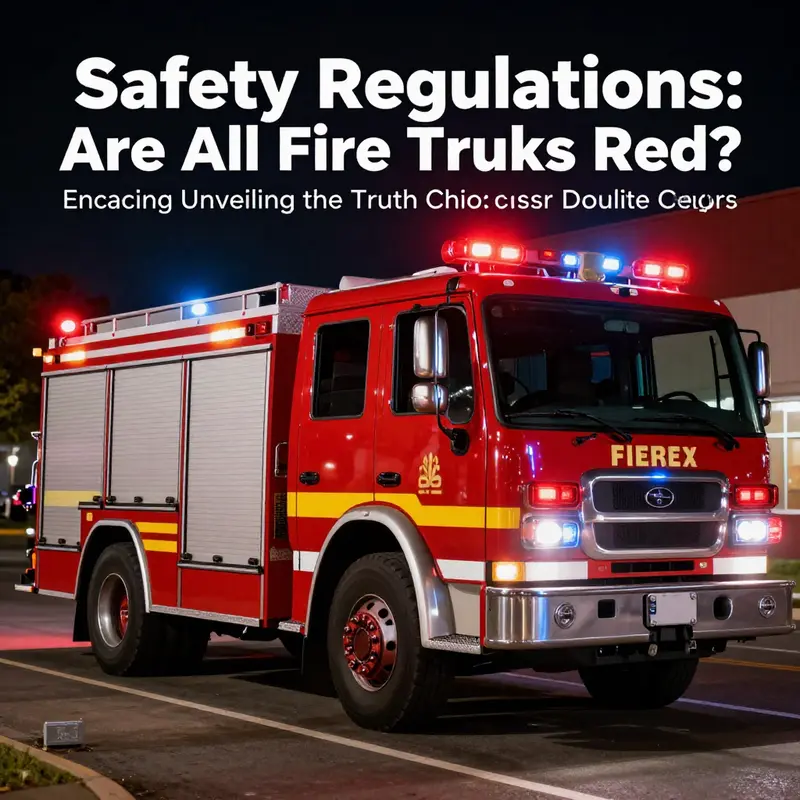
Color is more than decoration on a fire engine; it is a vital component of life-saving performance. When citizens hear the siren and see a blaze of lights, their first instinct is to respond or yield, and color helps trigger that reflex. The question of whether all fire trucks should be red sits at the intersection of heritage, human factors, and regulatory science. The answer is nuanced: red remains common, but safety standards and visibility research have nudged many departments toward colors that improve conspicuity in a wide range of lighting and weather conditions. In this sense, the color choice becomes part of a broader design philosophy aimed at reducing response times and increasing safety for both firefighters and the traveling public.
To understand why red became the default, it helps to look back to the early days of motorized firefighting. Red was chosen not because it was the only effective color, but because it stood out against the prevalent urban backdrop and the black cars of the era. It also offered practical advantages; red pigments were affordable and durable on metal surfaces, resisting corrosion and harsh weather. Beyond practicality, there was a psychological dimension: red communicates urgency and action, qualities that align with the mission of emergency responders. The influence of British fire brigades, which also used red equipment, helped cement a transatlantic convention that endured for decades. This blend of cost, visibility, and symbolism created a strong tradition that became deeply embedded in public imagination and department lore.
Yet tradition is not destiny when safety science evolves. Modern studies of conspicuity—how readily a vehicle is detected by other road users—have demonstrated that colors such as lime-yellow, fluorescent green, and vibrant oranges can offer superior daytime visibility and better detection in hurried or compromised viewing conditions, including fog, rain, and low sun angles. The findings are not merely academic; they translate into practical choices on the street. In many cities, officials have observed that lime-yellow and lime-green fire apparatus can be seen earlier than red in daylight and are easier to detect at moderate speeds, allowing drivers to respond more quickly to an approaching unit. This has prompted a shift toward brighter hues in new fleets while preserving the iconic red where departments want to maintain tradition or community association.
Of course, color does not act alone. The modern fire engine is a symphony of signals: color, lighting, reflective markings, and audible alerts all work in concert to grab attention and convey information. Reflective striping and high-intensity lighting have become essential complements to paint. Even the most conspicuous color loses its effectiveness if a vehicle lacks adequate retroreflectivity and illumination. Conversely, color alone can be powerful when combined with thoughtful design features and strategic positioning on the road. This synergy means that some departments opt for a high-visibility base color while layering in reflective patterns that enhance legibility at a distance and in complex urban environments.
In response to emerging evidence, regulatory bodies and transportation agencies have begun to codify conspicuity considerations into guidelines and standards. While the exact color is not uniformly dictated by one universal rule, there is a clear emphasis on achieving maximum conspicuity across all lighting conditions. The National Fire Protection Association (NFPA) and state or regional transportation authorities have moved toward recommending, or requiring in some jurisdictions, high-visibility colors and reflective materials on emergency vehicles. The intention is straightforward: reduce the time it takes for drivers to notice an approaching fire truck and slow down promptly, creating safer roadways for everyone involved.
The practical implications of these standards are visible in the field. In large metropolitan areas and coastal cities alike, departments have adopted bright yellows or lime hues for at least a portion of their fleets. The rationale goes beyond aesthetics: yellow and lime hues tend to pop against asphalt, brick, and urban clutter, particularly during daytime driving when color perception is most acute for the average observer. In nighttime conditions, retroreflective patterns and dynamic lighting compensate by drawing the eye to the vehicle regardless of color. The result is not a single, uniform color story but a palette of choices designed to maximize safety while respecting local identities and operational needs. Some departments also pursue hybrid approaches, using a base color that is highly visible and reserving red for certain vehicle classes or mission profiles to preserve cultural resonance while still prioritizing safety.
This blend of practicality and identity can be seen in depots and fleet decisions that balance public perception with safety data. Departments often consult with engineers, road-safety scientists, and field personnel to test colors under real-world conditions. They monitor how observers at varying distances perceive a vehicle at different times of day and in diverse weather. The decision-making process often involves pilot fleets that test color under actual duty conditions before committing to a broader rollout. These studies consider not only the color itself but the entire conspicuity package, including lighting patterns, siren tones, and even the geometry of the vehicle that shapes how it is seen from the sides and rear. In short, safety regulations are moving toward evidence-based design, with color as a key variable in a larger system of visibility.
Many readers will notice that this conversation about color is not purely about aesthetics. It touches public safety, driver behavior, and the speed at which help reaches someone in need. When a driver encounters a fire engine at a crossing, the color and the pattern of reflective tape can influence whether the vehicle is recognized quickly enough to yield or pass. It is a chain of perception that begins with the eye and ends in a safer, more efficient emergency response. In some cases, departments direct the public to consult their vehicle catalogs or parts inventories to understand how the color and equipment are paired on a given rig. For instance, a maintenance hub might provide a broad range of fire-truck-parts to keep a fleet in top form, including items that help maintain the integrity of color and reflective surfaces over years of service. See the catalog section dedicated to fire-truck-parts for a practical sense of how fleets are kept ready and compliant with evolving standards.
As the discussion moves from color to design, a crucial point emerges: color is a powerful signal, but it does not operate in a vacuum. The most conspicuous vehicle on the road still needs to be legible, predictable, and safe to maneuver around. The combination of a bright, high-visibility color with clear reflective patterns and well-placed lighting can create a margin of safety that red alone cannot guarantee. Departments that experiment with color often find it useful to pair their base color with distinctive, high-contrast markings that guide drivers and pedestrians alike. In this sense, color becomes part of a broader design vocabulary that communicates urgency, direction, and priority while supporting the morale and identity of the firefighting community.
The public-facing aspect of color is another facet of the conversation. Communities sometimes respond to color changes with curiosity or even critique, but conversations increasingly center on safety outcomes rather than tradition alone. When residents understand that a color shift correlates with improved visibility and faster response, acceptance grows. The change may be gradual, and the hue may be customized to reflect local culture or history, yet the core objective remains unwavering: to save precious seconds and minimize risk on the road. As readers think about why no single color dominates, they can also reflect on what it means to build trust between fire services and the neighborhoods they serve. The color work is, in a sense, a public-safety partnership, a visible reminder that readiness is a dynamic pursuit, not a fixed label.
For those who want a deeper dive into standards and guidelines, consider reviewing the latest NFPA guidance and related state resources, which increasingly encourage high-visibility colors as part of a suite of safety measures. These standards are not immutable edicts but living documents that reflect new research, field experience, and the evolving landscape of emergency response. They acknowledge that while red remains a cultural touchstone, the ultimate goal is conspicuity that supports safer operations in busy streets and during adverse conditions. In practice, this translates to fleets that can be red in spirit yet yellow in visibility where the science supports it, with every decision underpinned by an intent to protect life and property.
External resource: for authoritative information on current safety standards and recommended vehicle colors, see NFPA 1917 Standard for Automotive Fire Apparatus (https://www.nfpa.org/Code-Updates/2023-NFPA-1917).
ARFF trucks, Used firefighting equipment, Airport firefighting, Equipment auctions, Pumper trucks, Fire apparatus market, Logistics and compliance, Asset acquisition, Industrial equipment
ARFF trucks, Used firefighting equipment, Airport firefighting, Equipment auctions, Pumper trucks, Fire apparatus market, Logistics and compliance, Asset acquisition, Industrial equipment
community safety
The color of fire trucks is more than just a matter of preference; it reflects deep historical roots, evolving safety standards, and cultural identities. While red remains the iconic color of firefighting, the shift toward brighter, more visible colors enhances safety and reflects a modern understanding of emergency response. By acknowledging these changes, we not only celebrate the rich history of firefighting vehicles but also embrace the future as fire departments adapt to the needs of their communities. The conversation about fire truck colors encourages a wider understanding of how color choices can impact perception, safety, and emergency efficiency in an increasingly complex world.

